Fritz Kola
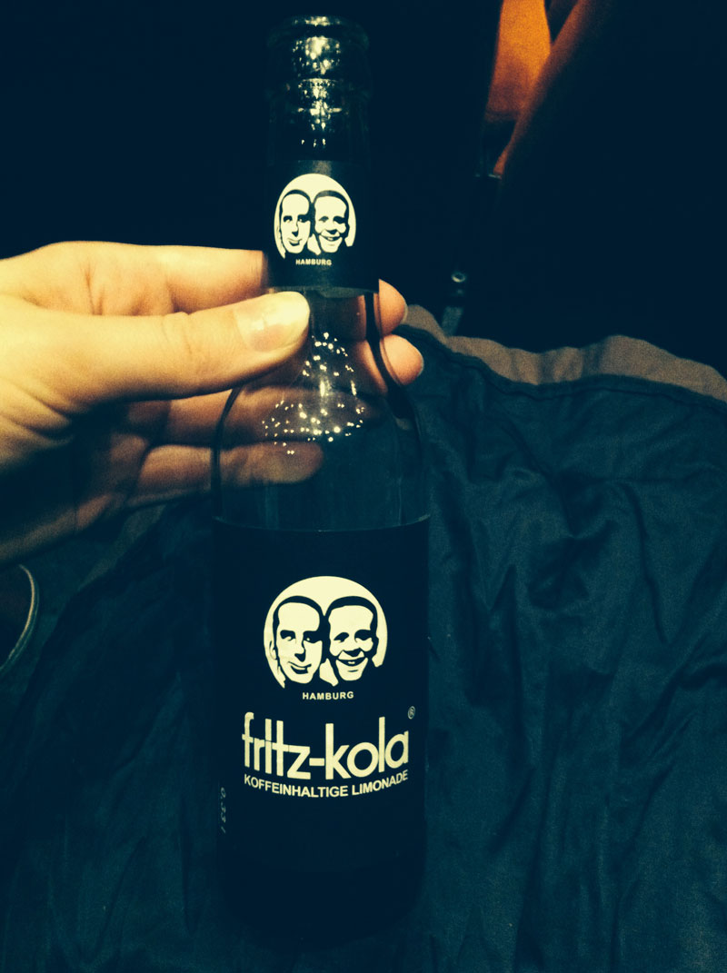
Once you started walking the streets of Berlin, you can't help to notice the ubiquitous Fritz Kola, a German alternative to Coca-Cola. It is definitely a treat of mine while at the movies!
A little about Fritz Kola from their own website: "it can be done better, two friends told each other. and after scraping together a few thousand euros of start-up capital, in 2002 they founded fritz-kola in their student digs in Hamburg/Germany. their mission: to create a new kola better than everything offered by the big soft drinks companies. and it was no sooner said than done. the fritz-kola project has been led by the same approach to this day."
What is endearing about this brand is how you can truly feel the "scraping" origins of the company. The logo looks like a bad photoshop filter (which in retrospect is probably just how they got it!) and it's a simple glue-on black label. In a world of polished and often over the top pop brands, it feels honest to the core.
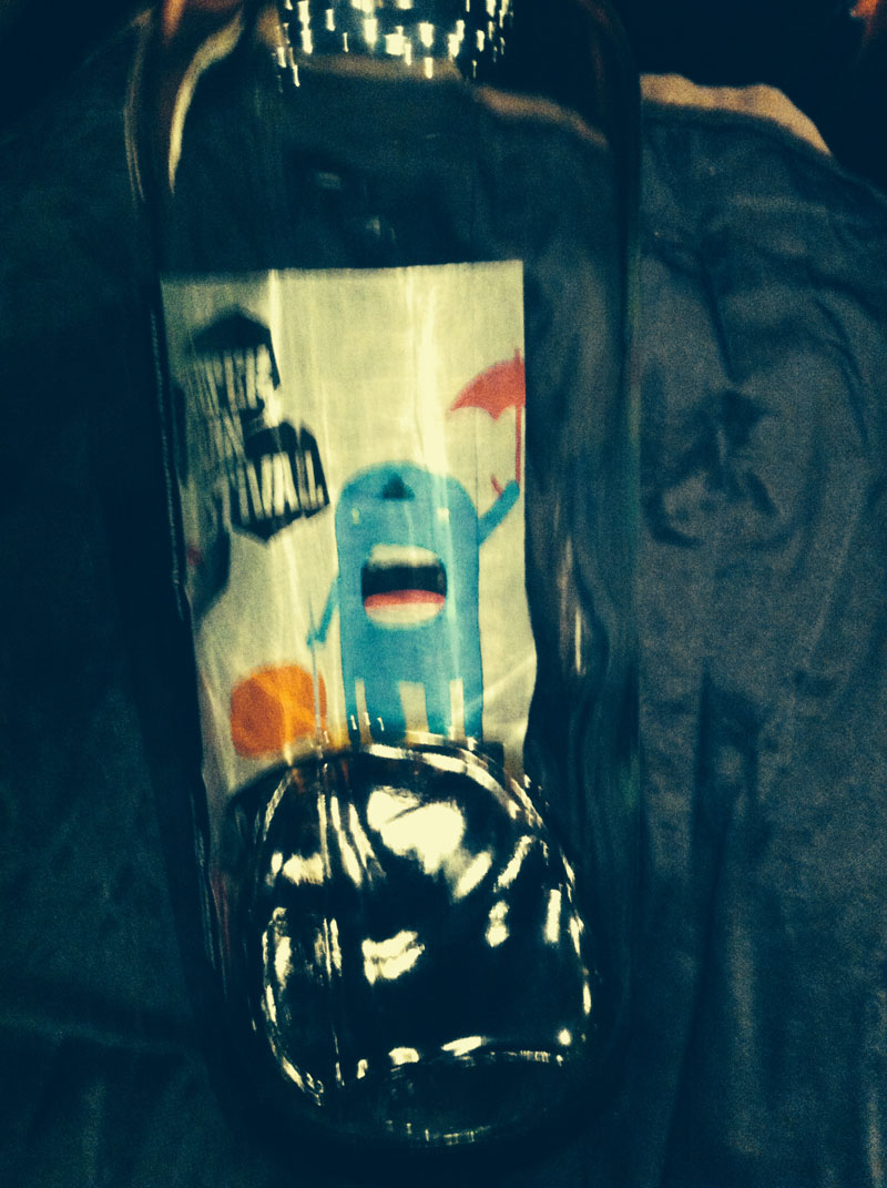
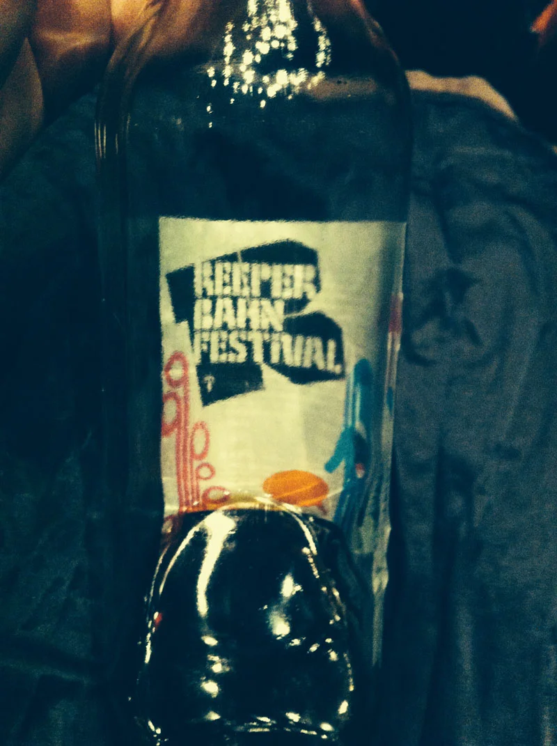
Nice little touch: the back of the paper label is colour-printed! You come to discover it as you drink the ratehr dark liquid. The message rotates, usually announcing a festival.
Such a nice way to remain current and involved in your community, while not compromising the identity of your brand!


